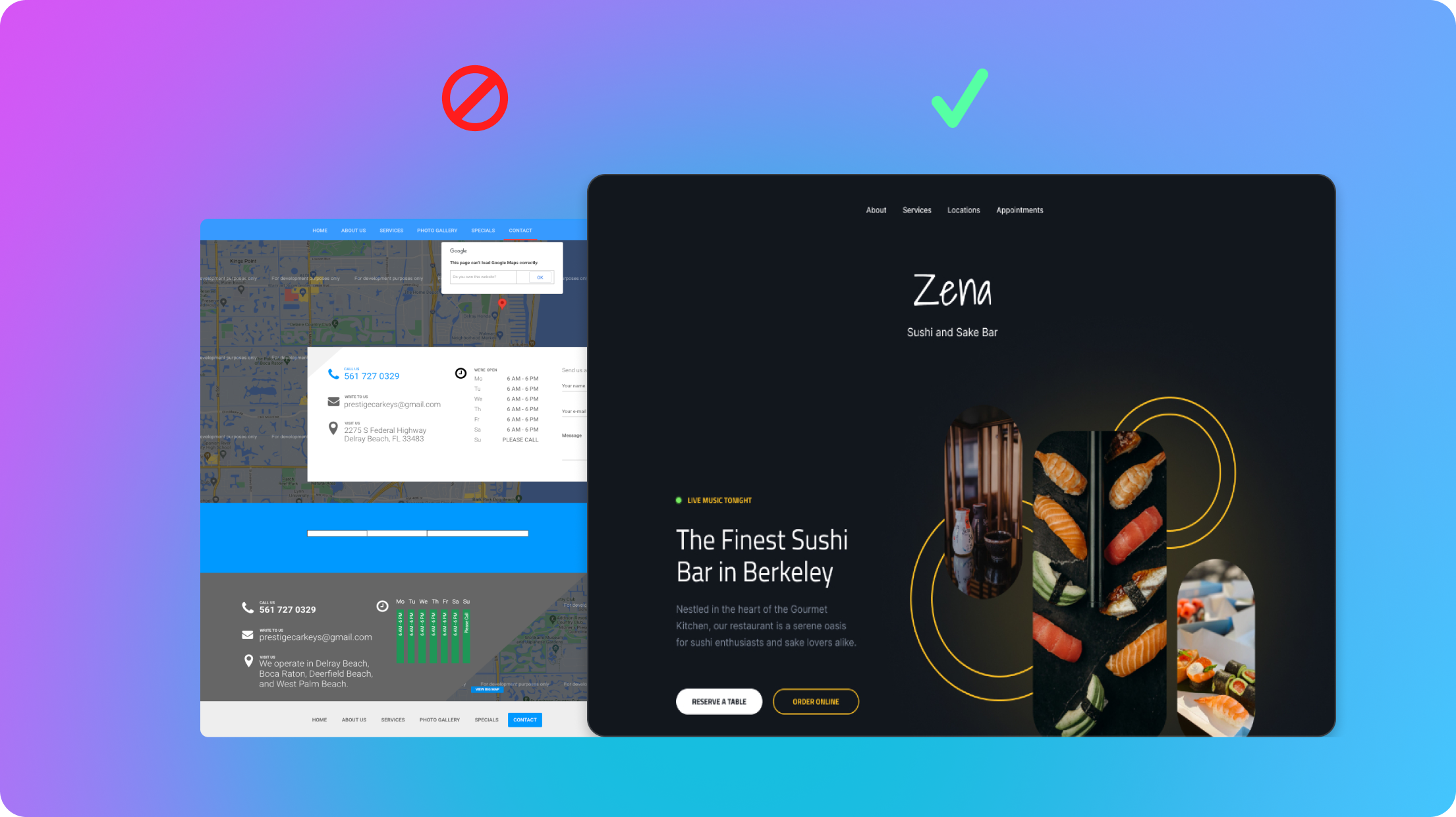
Many small business owners struggle with websites that no longer reflect their current offerings, have fallen behind modern design trends, or fail to provide an optimal user experience. This disconnect not only negatively impacts a business's ability to reach new customers, but also affects the perception of your brand's relevancy and professionalism. Transitioning and refreshing your outdated website can breathe new life into your online presence, making it a powerful tool for showcasing your products or services, attracting new customers, and retaining existing ones. By modernizing your website, you not only enhance its aesthetics and functionality but also improve its visibility on search engines, thereby opening up new avenues for business growth and success. You also don't need or retain an expensive designer or developer to do it. Even if you have no technical expertise, this guide will take you step by step through exactly how to migrate your old website yourself, all timed out to the minute!
Step 1: Review and Plan (10 minutes)
Start with a quick review of your website's content and design. Look for any outdated information, images that could be refreshed, or sections that might benefit from a more current approach. Outline the most important sections for your business and things that you would like to add or change about your current website. Prioritize changes that will have the most significant impact on your site's effectiveness and user experience.
Here are some of the main sections that we've tested to be most effective for small businesses based on over 100,000 websites we've built!
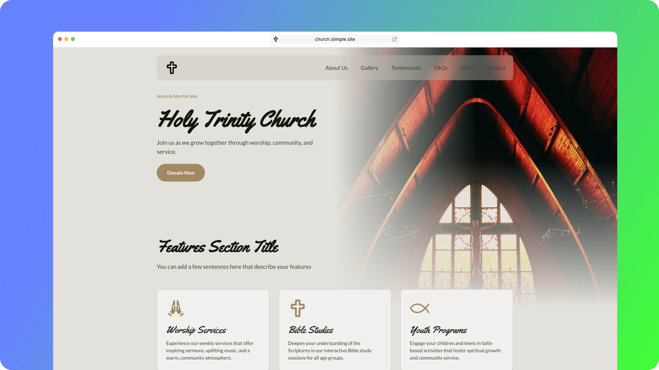
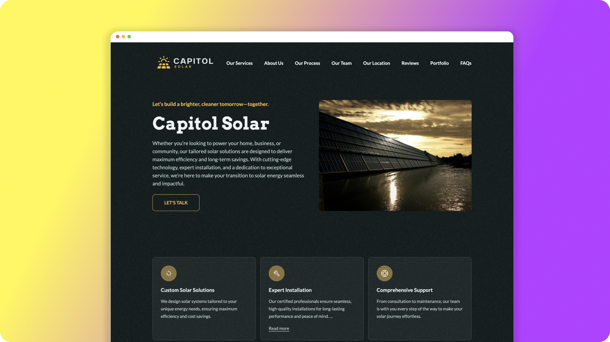
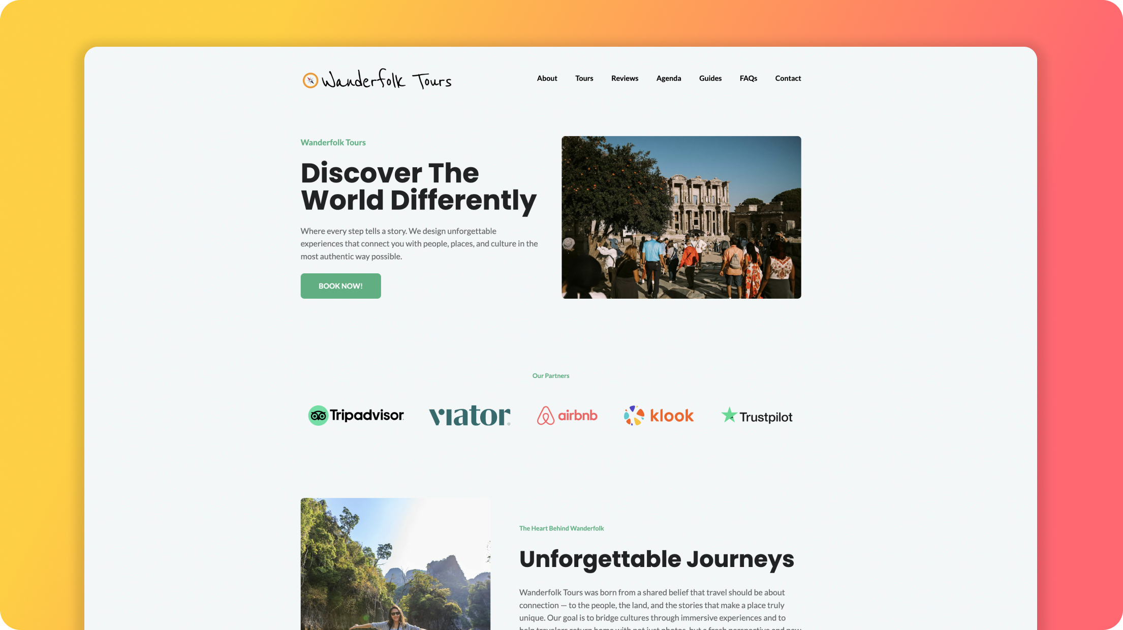
- Hero section - This is the section at the top of the website just beneath your navigation that features an image, introduction paragraph and call-to-action button. This is a great place for displaying a brief catchy headling/tagline and describing what you do/offer, who you serve and how you serve them. Here are some examples of tried and true, high-converting landing page/home page headline and taglines for small businesses.
- About section - This is where you can describe yourself or your business in more detail, things like how you got started, what your mission is and what they can expect from you.
- Features / Benefits section - This is where you can highlight a handful of features or benefits the customers can expect. This can also be a great place to highlight frustrations or pain points that your target audience might be feeling and how you can address them with your solution of service.
- Services section - This is often the bulk of your site's content, you'll want to clearly describe each service, item or product you offer with as much detail as possible. This is one of the best places to add keywords that your ideal customer may be searching for on Google. SEO (Search Engine Optimization) is what's going to get your website in front of more people who need your service or product! Make sure to add images here as this really helps communicate the quality of your offerings!
- Location section - If you are a local small business or have a brick-and-mortar location let your visitors know how they can visit you, what your hours are, and anything else they need to know or be prepared with before they come in to see you.
- Testimonials section - Don't underestimate the power of social proof and the genuine positive reviews of your business, service or product.
Step 2: Setup your Siimple account (5 minutes)
Although there are many website building platforms you can choose from, we recommend using Siimple because of just how fast and affordable it is. You won't need to fuss with any technical setup, you can build your site for free and when you're ready to publish it's just $10 a month with everything included (no fussy pricing plans to bother with or separate hosting to buy).
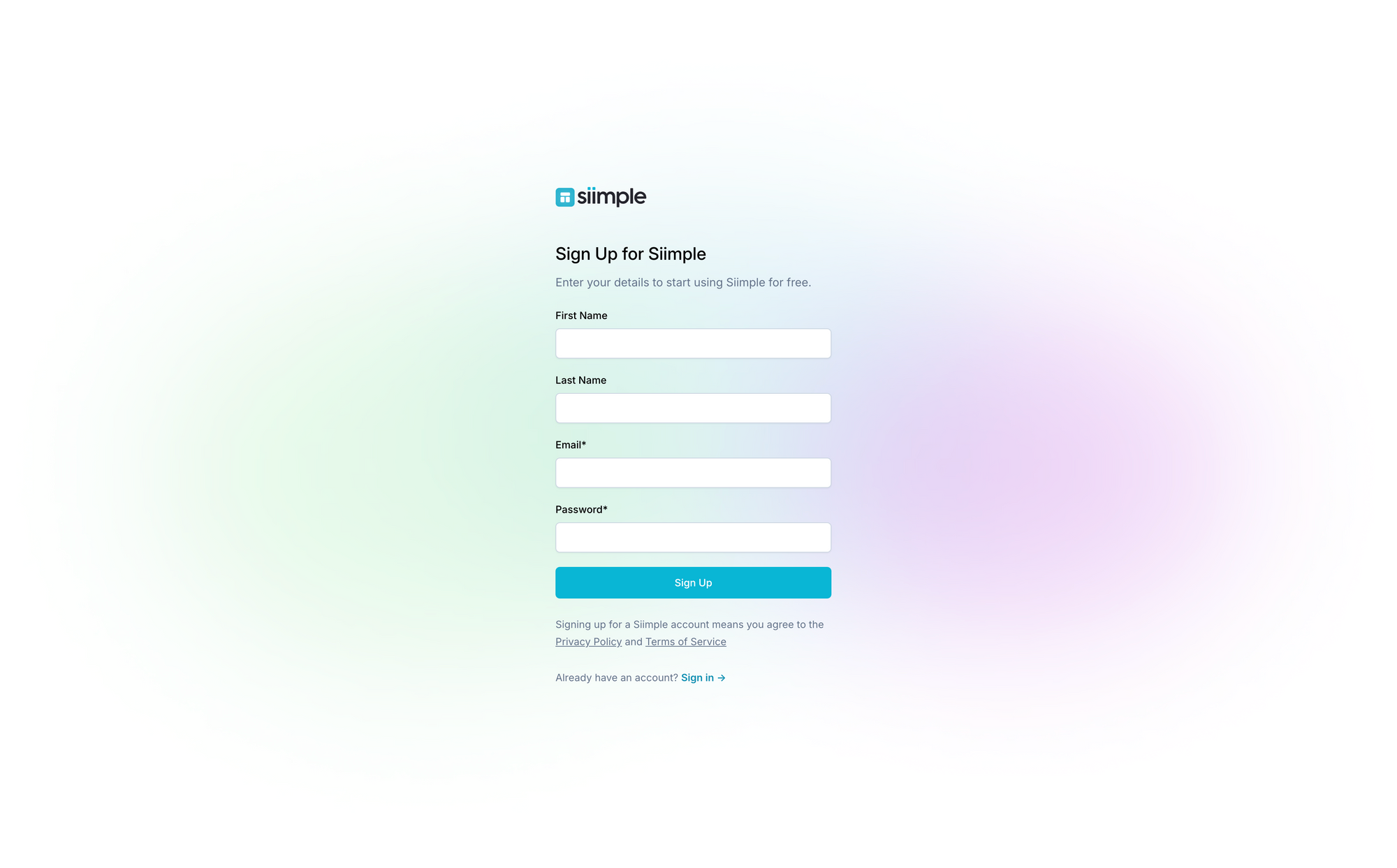
- Create your Siimple account
- Go to your email and find the activation email and follow the link inside to activate your account
- Add in the basic information about the site you want to create.
- Select a base theme design as a starting point (you can swap this out at any time).
Step 3: Update Your Content (10 minutes)
You don't need to worry about being perfect or getting every single piece of content added to your website, simply focus on the essentials to start with such as your business introduction, product or service descriptions, and contact information. Here are some things to consider:
- Ensure your business pitch is clear, concise, and compelling. Make sure your audience knows what you do, who you serve and how you serve them. Here's a formula for crafting the perfect opening line for your small business.
- Update product or service details to reflect your current offerings, including any new items or services. Use keywords to make them easily searchable by potential customers.
- Verify your contact information is accurate and easy for customers to find.
- Collect testimonials if you have them; social proof about your service or business is a powerful thing.
Step 4: Enhance Visuals and Layout (20 minutes)
Visual appeal is crucial for giving your users a sense of trustworthiness and professionalism when it comes to your business, serving as the immediate gateway to their perceptions and experiences. That's why creating your site on a platform that allows you to create high-quality, appealing visuals and design with the fuss is essential for establishing credibility and fostering a positive, lasting relationship with your audience and saving your time as a small business owner.
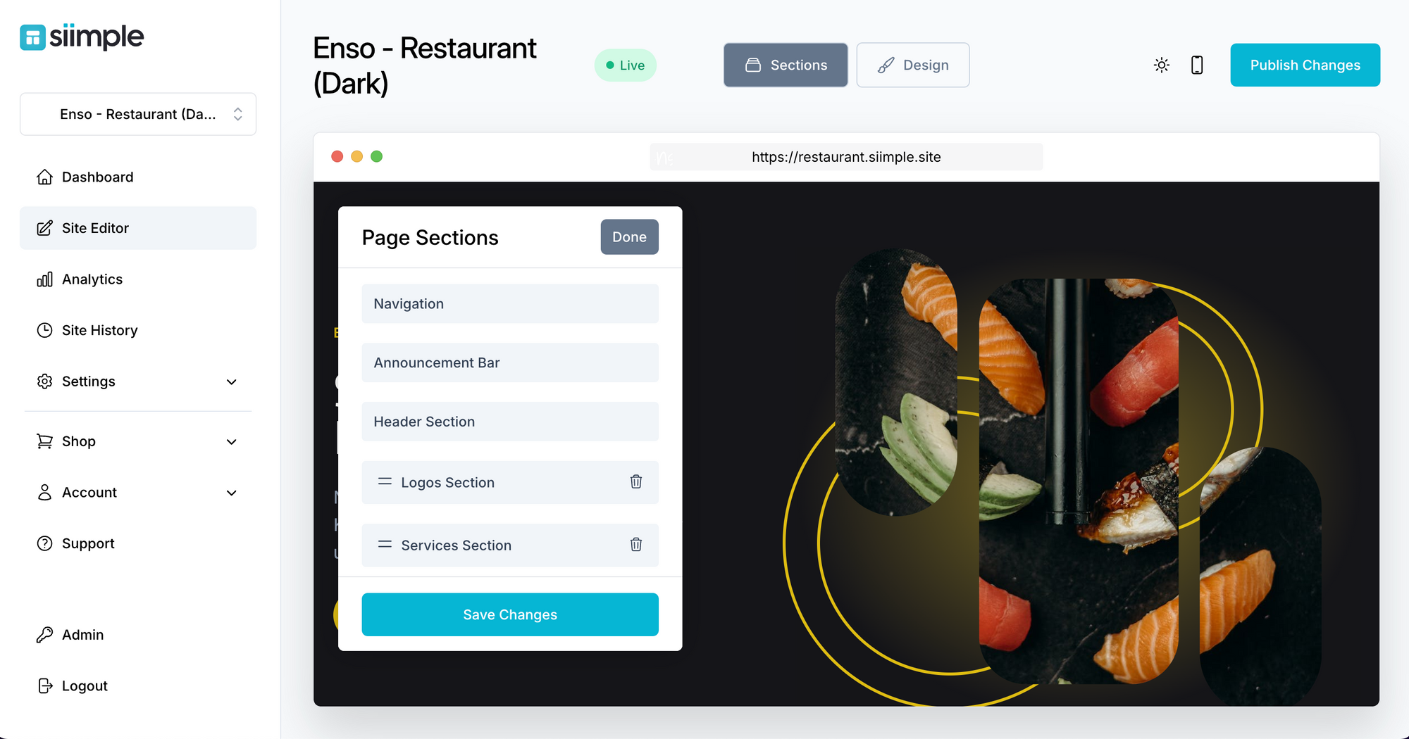
Once inside of Siimple you'll notice that there is demo content pre-loaded. To replace it with your own content just click on a section and it will highlight blue to edit. Then you can add your text and items to each section by clicking through the content modal that appears on the left.
- Upload a high-resolution logo - PNG, JPEG or SVG are all acceptable formats.
- Replace old images with high-quality, relevant photos to make your products or services stand out. Siimple makes it easy for you to select stunning, free stock photography from right inside your Siimple dashboard
- Adjust the order of your sections for better flow or remove sections that are not relevant to your business or needed at this time.
- Want to add some cool icons instead of images? Easy, just select from the assortment of thousands of incredible icons and graphics built into Siimple.
Step 5: Optimize for Conversion (10 minutes)
Your website copy and your call-to-action (CTA) button help your visitors understand how to take action and why. Your CTA button is usually located at the top of your website and lets your visitors know that they can purchase, buy, book, call or otherwise engage with your business or service.
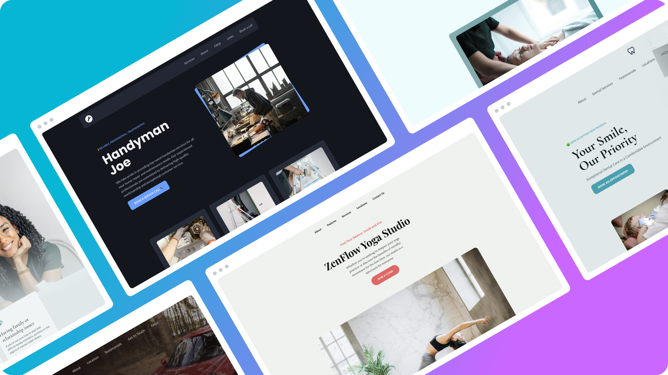
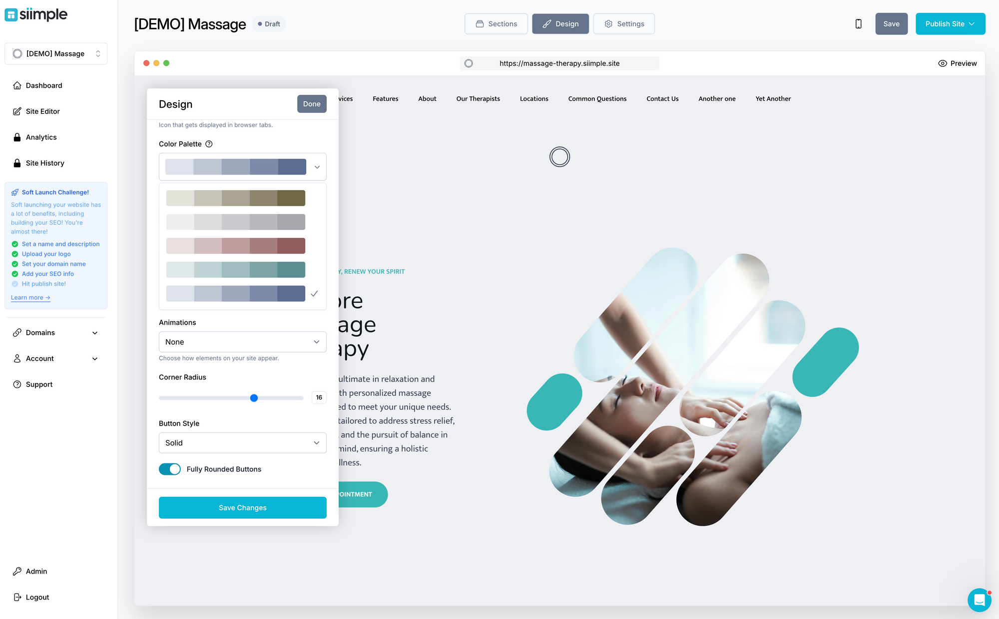
- Test different colors or text to make your CTAs more noticeable. You can do this by clicking on the design tab and changing your primary color or choosing a different color scheme.
- Use button text that makes them want to click. This could be a short phrase like Book a Free Call, Signup, Try it now, Call us, etc.
- Make sure to use keywords and phrases that your potential customers are already searching for on Google, these could be pain points, frustrations, how-tos or solutions. Add these everywhere you can throughout the copy on your website.
Step 6: Preview, Test, and Publish (5 minutes)
Before making your updates live, it's important to test that they look good and perform well on mobile devices and on dark and light mode (as this could change depending on the system settings of the viewer)
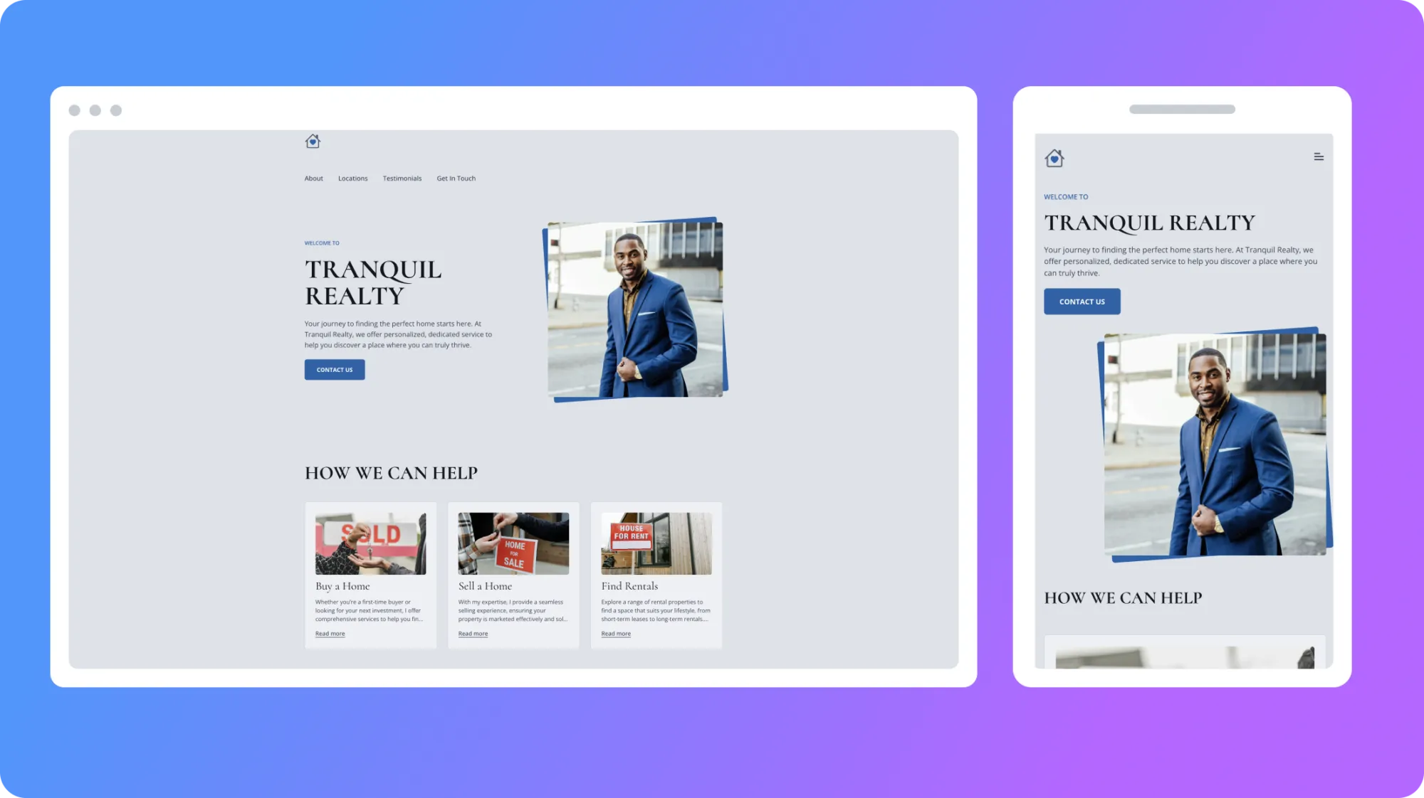
- Use Siimple's mobile preview feature to simulate how your updates will look on desktop, tablet, and mobile devices. This step is crucial for identifying any issues with responsive design or readability.
- Conduct a quick load time test to ensure your updates have fast your site's speed. Fast loading times are essential for keeping your bounce rates low and your SEO rankings high.
- Once you're satisfied with how everything looks and functions, proceed to publish your changes!
And that's it! In 1 hour or less, you can have an entirely new website for your small business that is always easy for any small business owner to update and maintain without the need to hire a designer, a developer or a webmaster!

