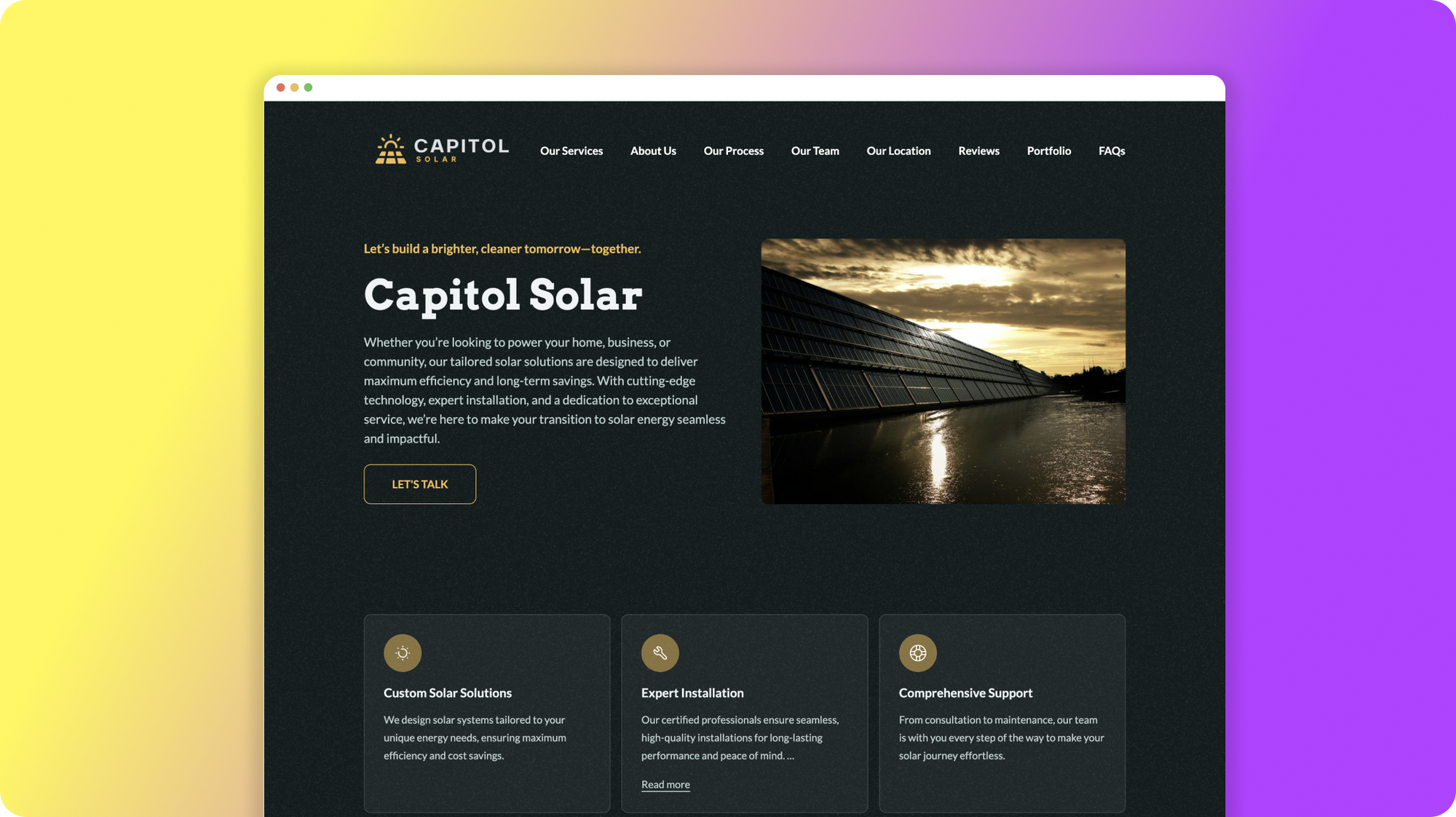
Creating content for your small business website is not just about filling pages with text; it’s about communicating something that resonates with your audience, enhances your brand identity, and ultimately drives conversions.
Whether you're a local bakery, a budding tech startup, or a local locksmith, the right imagery, copy and content can set you apart from the competition and connect you with your target market.
In this article, we’ll explore easy tips and useful resources to help you create compelling content that captivates and converts.
From understanding your audience to optimizing your message for search engines, these strategies are designed to help you effectively communicate the value of your business and engage potential customers. So, let's dive in and discover how you can elevate your website with content that speaks directly to the hearts and needs of your visitors.
🔑 5 Key Elements of Website Content
There are 5 important elements to any website that can't or break your site. Having built hundreds of websites for over 2 decades and analyzing over 20,000 web pages, we've distilled it down to these crucial things.
1. Logo - A Mark to Remember You By
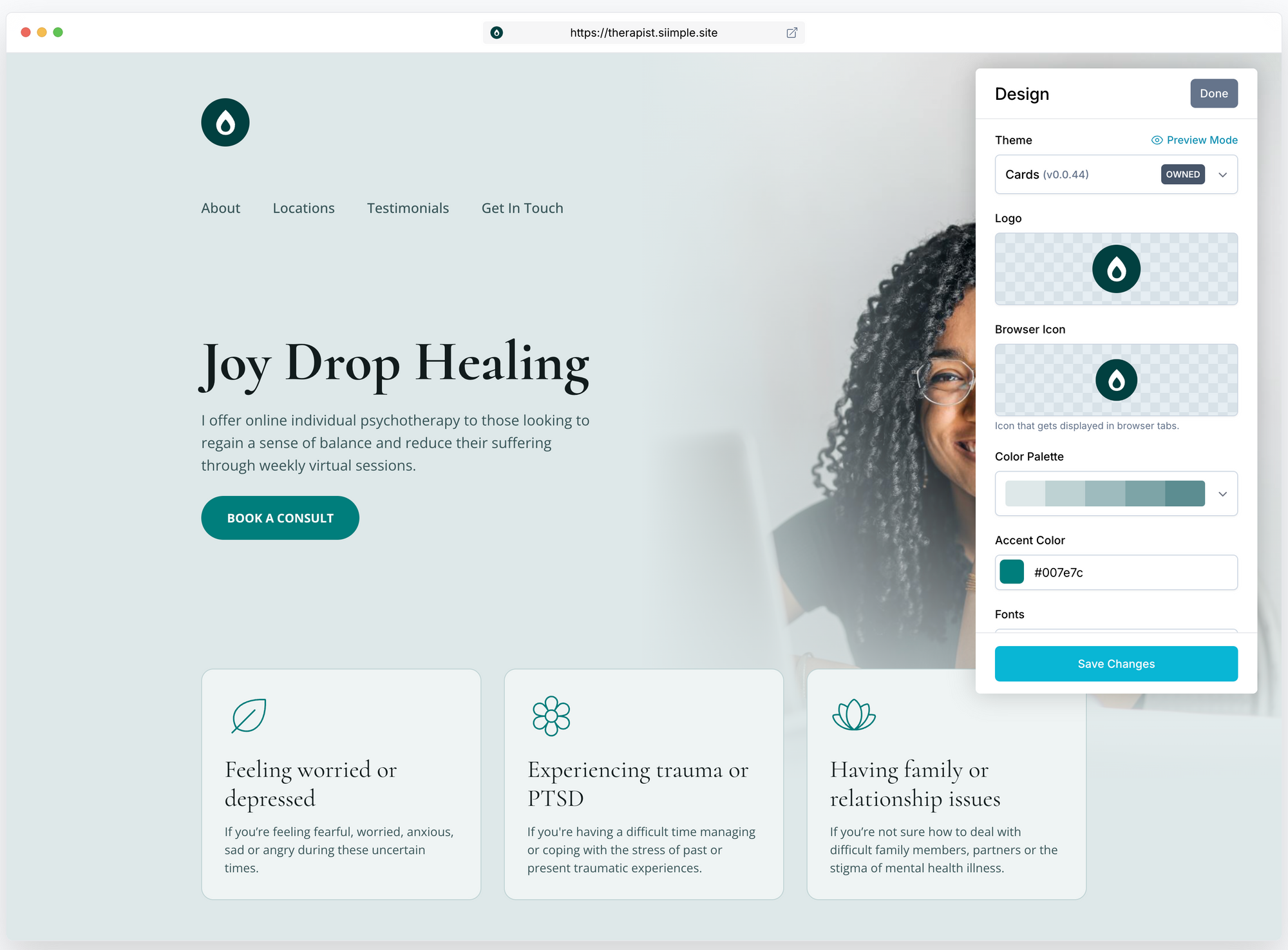
Your logo is a recognizable mark that is shown in a small size on your website as well as next to the URL of your website in search engines (also called a Favicon). Having a well-designed logo on your website is important because it helps visitors recognize and recall your brand anytime they see it.
- Keep It Simple: A simple logo is easier for people to remember. Think of some famous logos like the Nike swoosh or the Apple apple; they’re very simple but everyone knows them.
- Make It Unique: Your logo should stand out from others and be unique to your business. This helps people remember your brand better.
- Consider Colors Wisely: Use colors that match your brand’s personality and make sure they look good both in color and in black and white.
- Scalable Design: Your logo should look good at any size, whether it’s on a business card or a billboard.
- Favicon Version: Don't forget to create a small favicon version of your logo. This tiny icon appears in the browser tab when someone visits your site and helps reinforce your brand identity.
🧰 Resources to help you create a great logo
Namelix - Namelix is a cool site that uses AI to help you generate a business name or website name. It's also great for showing you branding and logo inspiration based on the names that it generates.
Canva - Canva is a great tool for creating all sorts of things including logos, website graphics and social media content. Best of all you can create a free account here.
2. Copy - Clarity and Simplicity Win
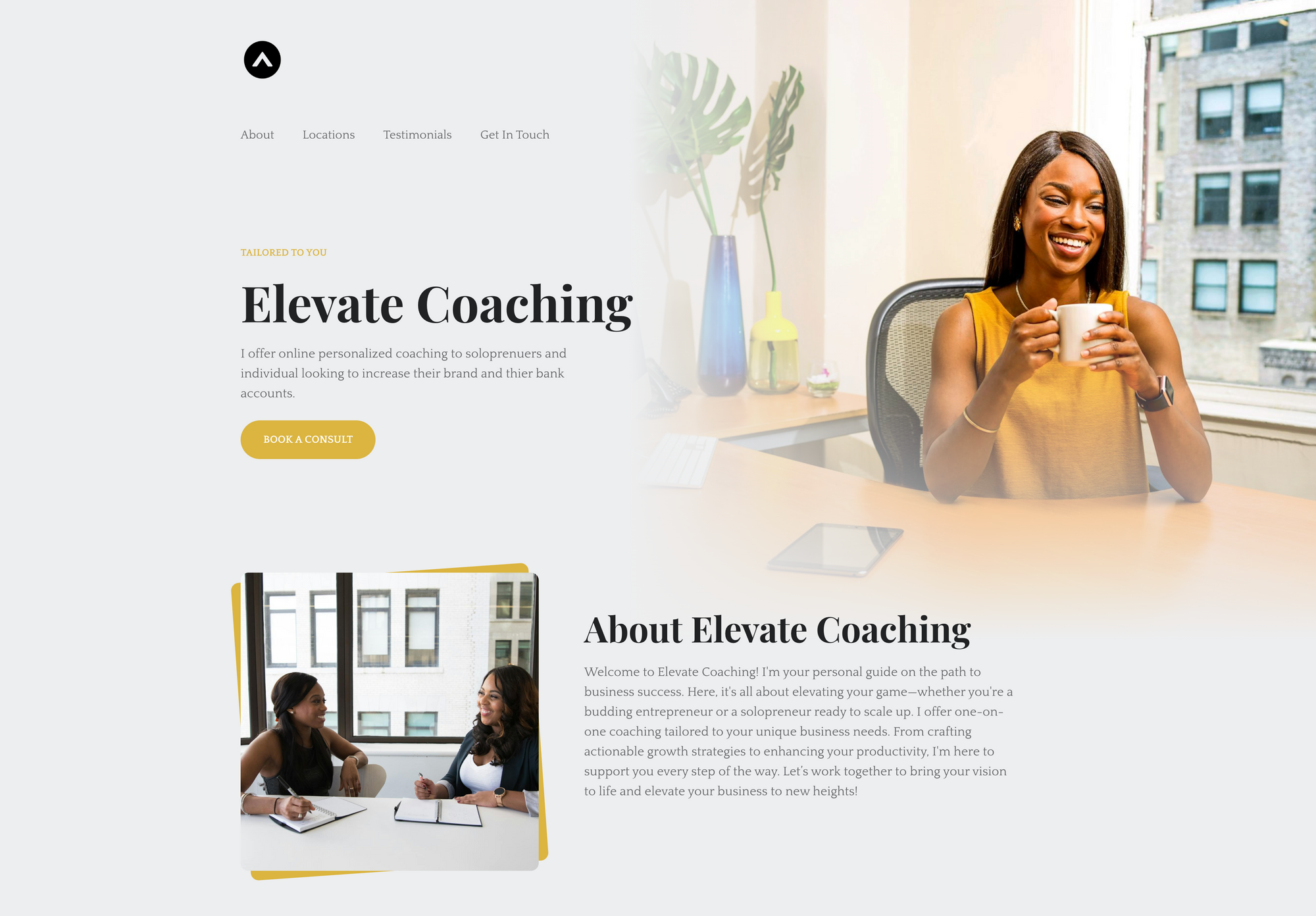
Copy, refers to the actual words written on the page. Ideally, you want the copy to do a few things well; describe your product or service in simple terms, make it obvious for, and make it easy to scan and comprehend at a 5th-grade reading level. You don't need to get too clever or fancy with your wording.
- Keep it Simple: Use straightforward language that can be understood by a wide audience. Avoid industry jargon unless it is common knowledge among your target customers.
- Be Concise: Deliver your message using as few words as possible. This helps in maintaining the reader's attention and improves comprehension.
- Focus on Benefits: Instead of just listing features of your product or service, emphasize how it solves problems or improves the user's situation.
- Use Bullet Points or Emojis: These are great for breaking down complex information into digestible pieces.
- Grammar and Spelling: Grammatically errors and spelling mistakes happen to the best of us so it's important to always run your copy through a good grammar and spell check plugin, extension or tool
🧰 Resources to help you write better copy
Grammarly - Grammarly is a digital writing tool that checks and improves your grammar, spelling, and style directly in your browser. The Grammarly web extension helps you write error-free and polished content for your website, enhancing readability and SEO. You can install it for browsers like Chrome and Firefox, making it easy to use on most online platforms.
ChatGPT - OpenAI ChatGPT is a chatbot developed by OpenAI that can chat like a human. It can answer questions, provide information, and help with various tasks by understanding and responding to text inputs.
3. Imagery - Pictures Tell A Thousand Words
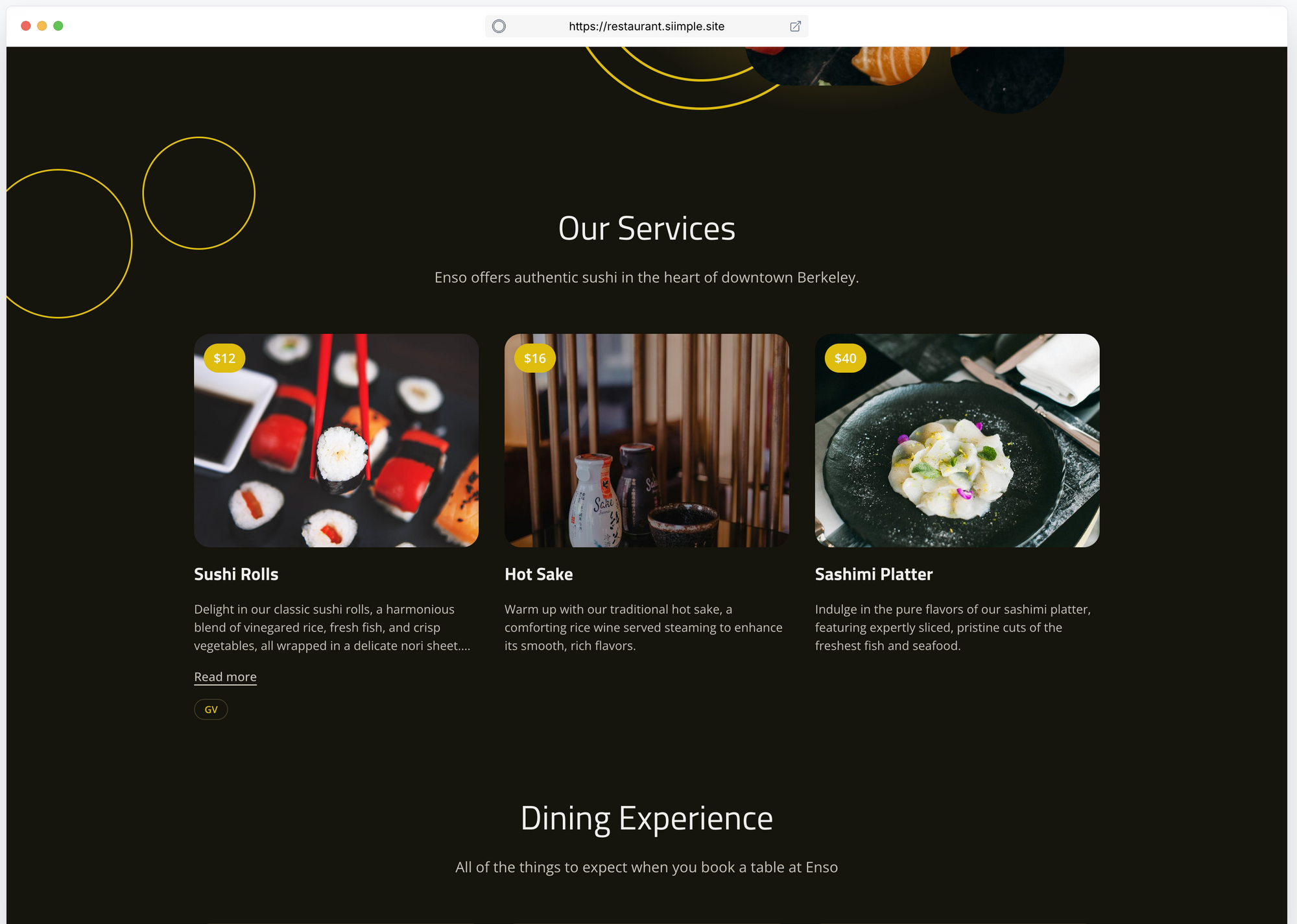
Visuals like photography, graphics, icons and illustrations play a key role in how your message is perceived. High-quality images, icons, and illustrations can help to better convey your message, evoke emotions, and influence conversions.
- Consistent Style: Ensure that all your visuals follow a consistent style that aligns with your brand this includes making sure icons are all the same style and thickness and that images are all high resolutions and have a similar composition, crop and tone.
- Relevance: Use images that are directly related to the content. This helps in reinforcing your message.
- Quality and size: High-resolution images are crucial. It's also important to make sure that they are sized correctly for the space where they will be displayed and have the correct aspect ratio so that they don't look ill-fitting, awkwardly cropped or cut off.
🧰 Resources to help you create better imagery
Canva - You can find graphic elements and stock photos on Canva for use on your website.
Fotor image editor - Fotor is a great, easy-to-use photo editing application that you can use to improve the quality and look of your existing images. It even offers AI tools to help you generate unique one-of-a-kind images. Here's a great tutorial on how you can use Fotor to create better hero images for your website.
Siimple stock images - You can search for high-quality, high-resolution stock images right from inside of our Siimple website builder and insert them into any area with our auto-resizer, ensuring that your images always look great and fit perfectly
4. Font Choice - Readability and Character Matter
The font you choose has a significant impact on the readability and overall aesthetic of your website.
- Legibility: Choose fonts that are easy to read on all devices. Simple, clean fonts generally work best for body text.
- Consistency: Limit the number of different fonts used on your website to keep it looking uniform and tidy. A pairing of 2 is usually more than enough
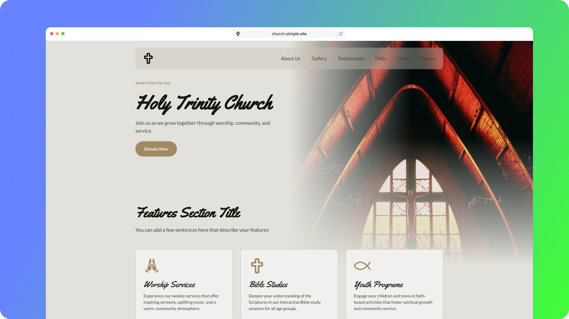
- Personality: The right font can also convey the personality of your brand. For example, a tech startup might opt for a modern, sans-serif font, while a bakery might choose a font with more curves and serifs to the letterforms.

🧰 Resources to help you choose the best fonts
Fontpair - Fontpair shows you different combinations of Google fonts so that you can get an idea of how they would look together on your site
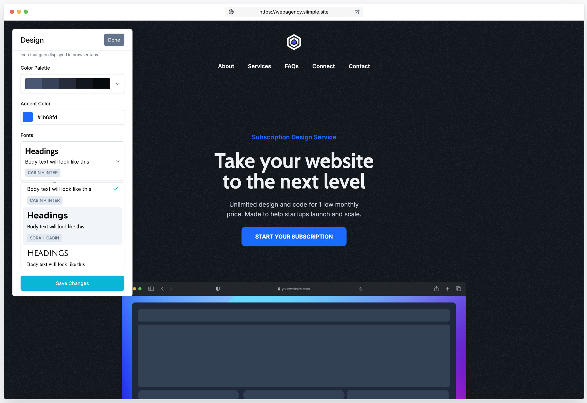
Siimple Font Pairings - Our website builder already has beautiful font pairings curated for you. Hand-picked by professional designers who have studied typography have chosen combinations that work best on websites for a variety of audiences and brands. These font sets have been stress-tested to look and work beautifully on all devices and you can select them with the click of a button.
5. Colors - Set The Right Tone
The main colors, accent color and color palette that you use have an impact on what visitors perceive about your site. Colors can make people feel a certain way, and make your brand memorable. Here’s how to choose colors wisely:
- Choose your brand color - Choosing a main accent color that matches your logo and other marketing materials can be very useful in creating a cohesive and memorable brand identity. This helps people recognize your business and ties together the other elements on the website.
- Understand Colors: Different colors are often associated with different things. This is often referred to as color psychology. Understanding this might help you choose a color that aligns with the interests and perceptions of your target market.
- Easy on the Eyes: Make sure there’s a good contrast between the color of your text and the background so everyone can read it easily. This is referred to as accessibility and it's important that this is taken into consideration for the copy and imagery on your website.
🧰 Resources to help you choose great colors
Guide to Color Psychology and the Meaning of Colors - This guide is useful to help you understand the hidden meaning behind colors and guide you to choosing one that works for your brand and resonates with your audience.
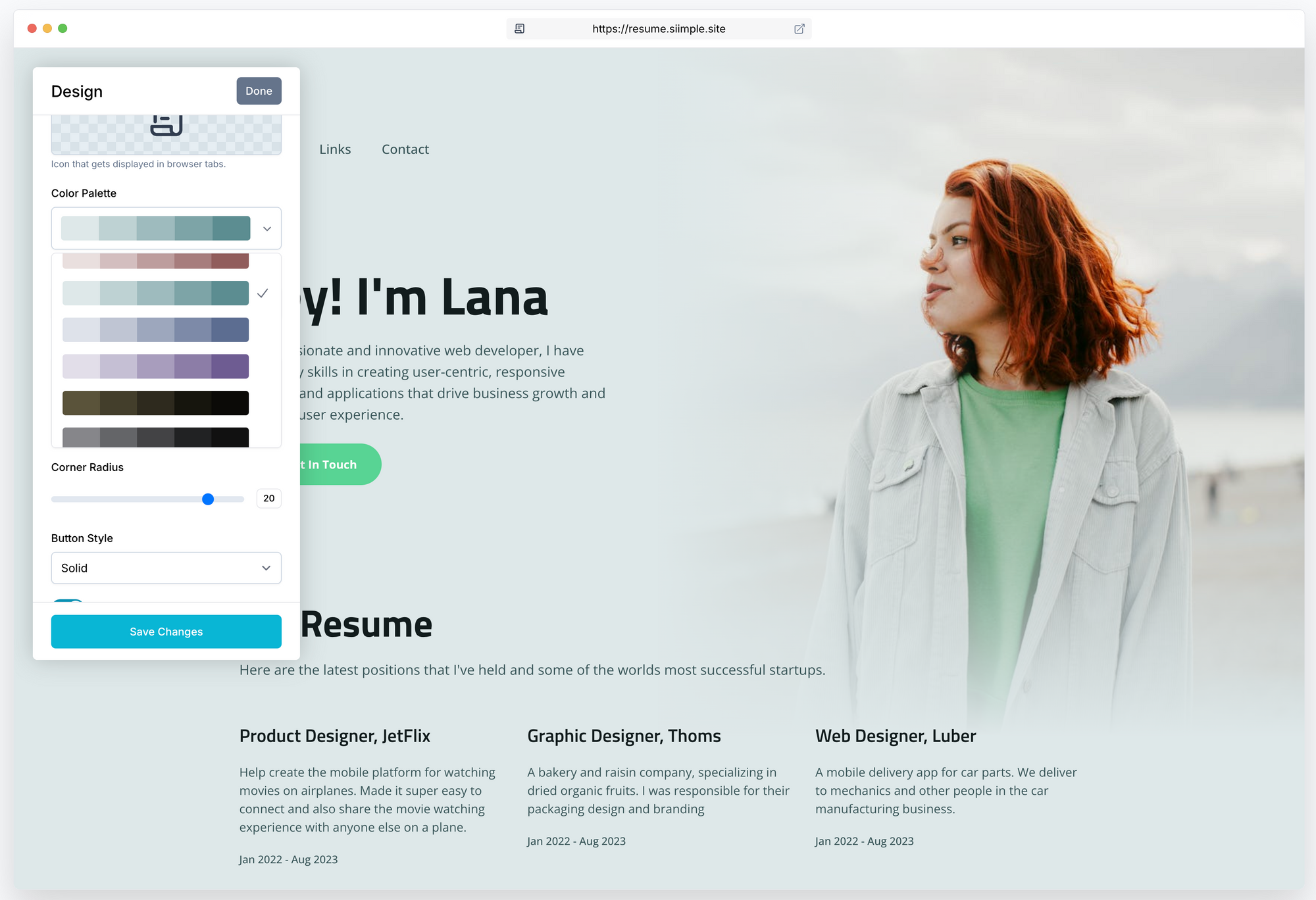
Siimple Color Palettes - Our Siimple website color palette generator is amazing because it allows you to try out multiple color schemes and accent colors on your actual website content and change them whenever you like non-destructively! Our color palettes are hand-chosen by design professionals and already perfectly matched, paired balanced to meet current design trends and the highest accessibility standards.

